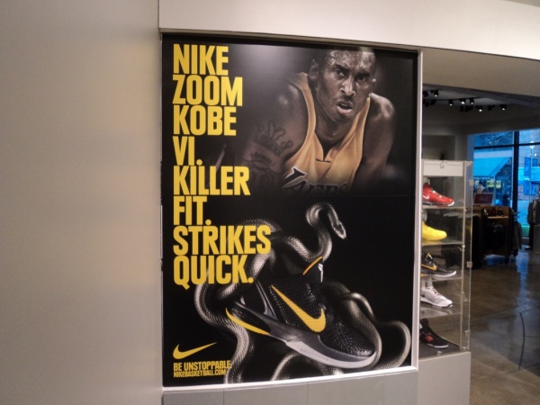
The ABCs of Retail Graphics Installations
When it comes to retail graphics installations, do you know your ABCs? At Pro Graphic Install, we do retail graphics installations, but allow us to give you a few tips. Retail graphics installations can become an overwhelming task – don’t fret, we got your back! Here are the ABCs of retail graphics that we would like to share with you today so your next installation will be…well…a breeze.
A is for Artwork

It’s important to have strong artwork that will resonate with your customers. A lot of graphics are aesthetically pleasing but are vague in messaging. It’s important to build a brand around your products, so use graphics to bring your brand to life and draw attention away from generic competitors. The graphic should be representative of your company’s values and should stand out.
It’s also important to put some thought into where these graphics will be located. Pick colors for each location, since light impacts what colors show up well. For example, green can be difficult to see when it is against black text; choose different hues for interior signage than exterior signage, so they stand out more when lit at night.
B is for Background
When it comes to selecting a background, there are a lot of questions you’ll want to ask yourself. What color is the store? What products do they sell? Do they offer certain promotions? Backgrounds come in all sorts of shapes and sizes, some with textured edges or sewn stripes, some are made from canvas and some from recycled plastic. No matter what type you decide on or already have, if you’re looking for something modern and lightweight, vinyl backgrounds are the way to go. They come in an assortment of colors, making them perfect for retailers who have a variety of products that need showcasing. Placement is key for these; hanging them too high will cause your graphics to appear tiny and your customers won’t be able to read the content below.
C is for Consistency
This all begins with your branding. How do you want to represent your brand? Simple and elegant or flashy and bright? Choose a style and keep it consistent across all signs and graphics for the best impact. This includes keeping signage consistent with the logo, if you have one. If not, start to think about what type of fonts, size, color schemes, and styles you would like on your store’s signage. These will help in creating an attractive storefront that is cohesive and communicates clearly who you are. Keep in mind that windows can be overlooked as they are mostly seen at night when they’re lit up but they can also create an incredible first impression as well! To create an unforgettable entrance, we recommend installing signage that doubles as a window display – this way every time someone walks by they will see your beautiful storefront!
Tags: retail graphics
